Updating our Dungeon Tilesets
The old template
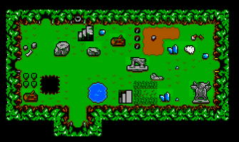
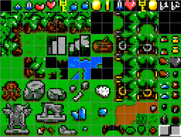
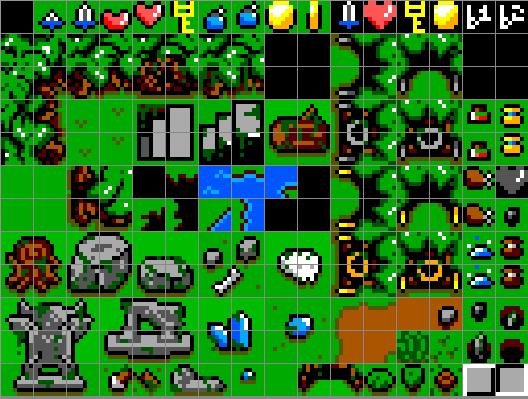
When starting work on Afterschool Adventurers Club, one of the first thing I designed was our templates for the dungeons. Back then we settled on a perspective ala Zelda. To achieve this look, we used 4 different 16x16 tiles:
- 1 Corner Wall, that would be mirrored by X and Y to fit the four corners
- 1 Side Wall, that would be mirroed by X to fit the left and right walls
- 1 Facing Wall, that would be mirrored by Y whether it is on the top border or bottom one.
- 1 Protruding Corner Wall, morrorred by X and Y, and used with the Side Walls in order to create any kind of shape
The tileset for the Forest, our first dungeon in the game, looked like this:
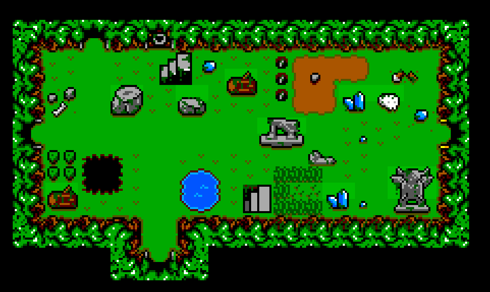
It was doign the job well enough at first. Here's one of my test room built in Tiled:
But... As time went by, there were two main things I started to dislike about our template:
- The walls were too small. At only 2 tiles high, they were the exact same size as the player and, actually, smaller than a lot of our planned enemies/bosses
- The perspective was off for buildings. Our second dungeon takes place in a castle environment, and the bottom walls were anoying me. It felt to me that they were upside-down, and that the player and monsters should be able to get behind a bottom wall.
I knew that changing something which our dungeon engine was heavily based on meant a lot of work for both of us. However, we were already wasting a lot of space for the loot and what I had in mind simplified the layout as well, meaning we would be able to add a lot more variety to our tilesets. So we went with it.
The new tilesets
The first thing I did was to bump the height of the walls to 4 tiles, and allowing the player/monsters to go behing the top one. Technically, it would be more "realistic" to let them go even lower, but, for gameplay purposes, we decided that everything should always be visible on-screen at all time. Then, I got rid of all that black that would be outside of our room's shape by creating a pattern we can repeat instead. I also simplified the doors, so we would have only 2 instead of 8, and moved cleanly all the animations to a separate file.
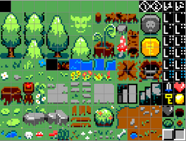
Now that we had a lot of extra space, I was able to diversify our floors and add more object behind which the player/monsters can go. Which brings us to our new Forest Tileset:

Which has:
- 2 variations of Walls
- 21 single main flooring tiles
- 8 single alternate flooring tiles
- 4 2x2 flooring tiles
- 3 1x2 flooring tiles
- 8 objects we can go behind
- animated path-blocker
- 2 destructables
- animated water
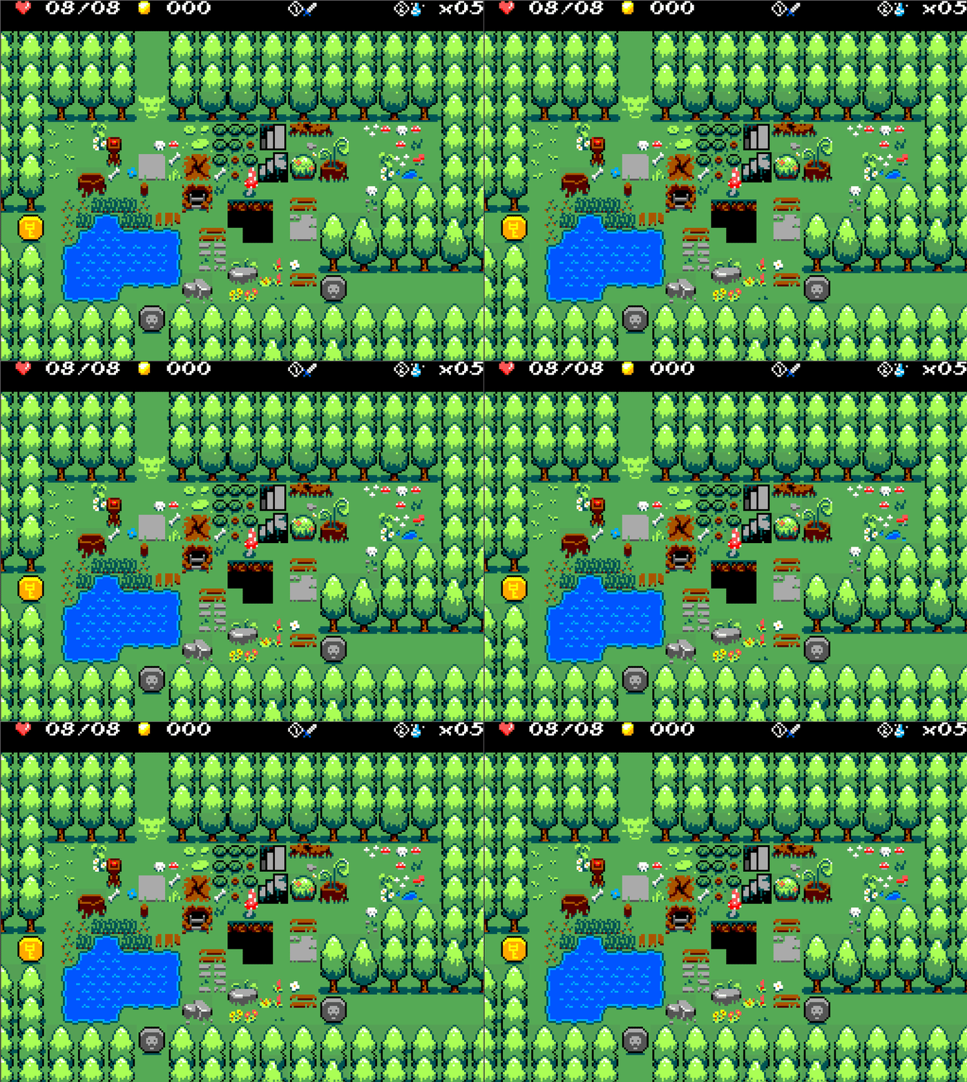
So, our Forest now looks more like this:

Next step: redoing our Castle tileset using this new template!
Cheers,
V
Afterschool Adventurers Club
Randomly generated Dungeon Crawler with Rogue-Like elements, set in a Tabletop Role Playing Games Club in the 80's
| Status | In development |
| Authors | raphnet, VolcanLoup |
| Genre | Adventure |
| Tags | 8-Bit, Dungeon Crawler, master-system, Roguelite |
More posts
- What's Up With AAC #5Nov 21, 2024
- What's up with AAC #4Dec 15, 2023
- What's up with AAC? #3Oct 15, 2023
- What's Up With AAC? #2Oct 05, 2023
- What's up with AAC? #1Aug 30, 2023
- Progress update: Shop UI for Magic/Weapon upgradesApr 23, 2023
- Room layout randomisation and path findingOct 21, 2022
Leave a comment
Log in with itch.io to leave a comment.